Two platforms, two looks, one user
When I joined Anza, the company was mid-migration. There were two platforms: Horizon, the new one, and Classic, the legacy platform. Solar buyer had already moved to Horizon, but Solar supplier was still on Classic. The two platforms looked and behaved differently: different components, different patterns, different visual language.
Users didn’t get to pick one. Their workflows crossed both platforms: a buyer might filter products on Horizon, then switch to Classic to check supplier details. Two platforms with two looks, navigated in the same session.
My first project was building a third product, the ES Storage platform, on Horizon. Storage is significantly more complex than Solar: more product attributes, more comparison dimensions, more filtering needs. I was tasked with fitting a harder problem into a mold that didn’t even fit the simpler one perfectly.
My role
I owned the design system end to end: the token architecture, component design, Figma library and the collaboration model with engineering. I worked closely with the engineering team to make sure components were properly documented in Storybook. But the system wasn’t a standalone project. It grew out of the product work. Storage required custom components that didn’t exist yet, which meant extending the design system I had adopted when I joined, then looking back and applying those improvements to Solar as well.
It required looking at the platform holistically. We quickly started building the Storage supplier product on Horizon while still maintaining Solar on Classic. That meant juggling three products on two platforms with two different looks, while trying not to create an extremely different experience between the two, because our users were still navigating both in the same workflows.
We eventually brought the Solar supplier out of Classic entirely and built a unified Supplier platform on Horizon, where Solar, Storage and Transformer suppliers all lived together, mirroring how all three product lines already lived together on the buyer side. The design system made that consolidation possible: the same components, tokens and patterns transferred directly to the supplier experience without a redesign.
As the number of products grew, each with both a buyer and supplier side, the design system had to solve problems it wasn’t originally scoped for. Navigation was the biggest one. With three products across two apps, users needed to move between Solar, Storage and Transformers without losing context. The existing approach used a “product switcher,” a toggle that forced you to choose which product you were in before doing anything. I pushed to replace it with free navigation: each nav item (Projects, Product Library, etc.) expanded to show all three product lines, so a user on a Storage projects page could jump directly to the Transformers product library without switching modes first. That decision reshaped the entire navigation architecture and became the foundation for the navigation redesign.
Free navigation: the nav bar
Each nav item expands to show all product lines. The colored dot next to Dashboard reflects the active product.
Product color dot system
The pulsing dot next to Dashboard acts as a persistent indicator of where you are across product lines.
The approach: build with, not before
A design system built in isolation accrues debt the moment it meets real products. I took the opposite approach: I started with the hardest product. Storage’s complexity forced me to build components that were robust enough to handle dozens of filterable attributes, multi-dimensional comparisons and dense data tables. If a component survived Storage, it could handle anything else on the platform.
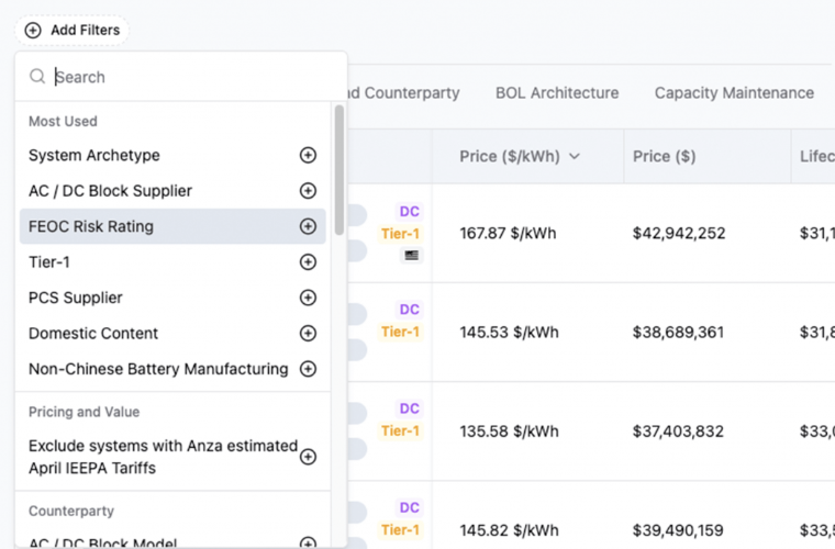
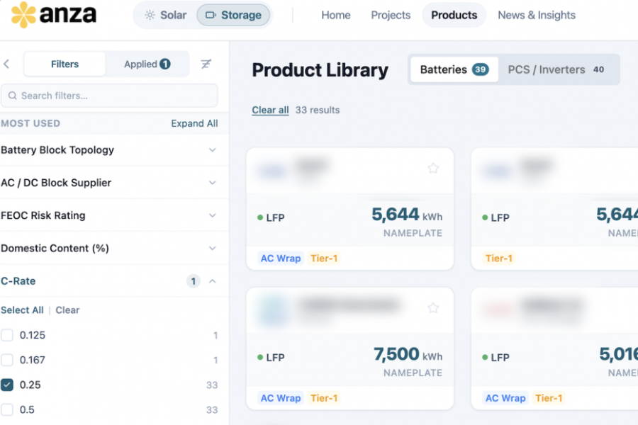
Every component entered the system only after it had shipped in a product. Storage contributed the filter rail, product cards and comparison view. Solar Pulse contributed dashboard widgets and the segment detail layout. The supplier directory validated that the card and filter patterns scaled to a new domain without modification. Nothing was speculative. By the time a component was documented, it had already proven it worked.
This also meant the system became the bridge between the two platforms. Even though Classic and Horizon had different codebases, the shared design language made it possible for users to move between them without feeling like they had switched products.
Token architecture
Semantic tokens referencing a shared primitive scale, so the same component adapts across light and dark modes and product-line tints.
The foundation: shadcn, Tailwind and Figma
I started with shadcn and Tailwind, which gave us a strong baseline of accessible, composable primitives. The token architecture diagram above shows how the Tailwind color scale mapped to semantic roles across the platform.
I built the Figma component library on top of that foundation, collaborated with engineering to document it in Storybook, and extended it with Anza-specific patterns that shadcn doesn’t cover: stacking order rules, page margins for fluid, ultra-wide, wide and content layouts, kebab menu patterns and more.
The system has three layers. Tokens define the visual language: the Tailwind color scale, typography, spacing, radii and shadows. Components are the building blocks: cards, buttons, filters, tabs, tables, form controls and data display patterns. Patterns are compositions: the filter rail, comparison views, product detail layouts and dashboard widgets. Everything references semantic tokens rather than raw values, so the same component renders correctly across product-line colors and in dark mode.
Type scale
One family, five weights, a constrained size scale. Inter for everything.
How the system enabled speed
The Product Library shipped in two weeks of design. Solar Pulse, a dashboard with four widget types, shipped next. The supplier directory launched on the same foundation and reached half of active companies within two months.
Each product contributed components back to the system. The Product Library contributed the filter rail, product cards and comparison view. Solar Pulse contributed dashboard widgets and the segment detail layout. The supplier directory validated that the card and filter patterns scaled to a new domain without modification.
Component reuse across product surfaces
Core components built once, then adopted across products. Each row shows where a pattern shipped.
The third pillar: Claude as a design system consumer
The system started in two places: Figma for design (every component with its variants, states and spacing specs) and Storybook for engineering (the production components built on shadcn and Tailwind, with interactive examples and prop documentation). I owned the Figma library and collaborated with engineering to ensure Storybook components were properly documented with accurate props, states and usage guidelines. Both sides referenced the same token names.
As the team used Claude more for prototyping and development, it became clear that Claude was a third consumer of the design system, and the least disciplined one. Without guardrails, Claude-generated code drifted: wrong tokens, inconsistent spacing, components that looked close but weren’t quite right. The inconsistency was subtle enough that it passed review but compounded across surfaces.
I started documenting the design system in Claude and writing skills that encoded the rules: stacking order, page margins for each layout type, component APIs, color token usage and pattern conventions. The skills turned Claude from a consistency risk into a consistency tool. With them in place, Claude-generated code stayed on-system by default. And as the system and skills got more robust, something shifted: it became easier to create brand-new components that were consistent across all six product surfaces from the start, because the skills encoded the same judgment calls I would have made manually.
Dark mode
Dark mode wasn’t an afterthought. Every semantic token has a dark-mode counterpart, defined alongside the light value. Components never reference raw colors, so flipping modes is a token remap, not a redesign. Accent colors shift from saturated (light) to pastel (dark) to maintain contrast: --accent moves from #8A2DA8 to #CFA2E3.
Reflection
What worked. Starting with the hardest product was the right call. Storage’s complexity forced the system to be robust from the beginning, which meant simpler products adopted it without modification. Building alongside products instead of ahead of them meant every component had a real use case before it was documented, and adoption was immediate because teams were already using the components that became the system.
The dual-platform constraint helped. It would have been easy to treat Horizon and Classic as separate worlds. The constraint of users crossing between them in the same workflow forced the system to define a shared visual language that worked regardless of the underlying codebase. That discipline made the system stronger.
What I’d change. I’d formalize the contribution model earlier. Components flowed back into the system, but the process was informal: I reviewed and documented each one. A clearer intake process with criteria for when a product-specific component graduates to the system would have scaled better as the team grew.
The outcome. Three products shipped in six weeks using shared components. Design-to-handoff cycles dropped to two weeks. The system is now the default starting point for every new surface at Anza, whether a designer, an engineer or Claude is building it.