Quake Prep: A Case Study
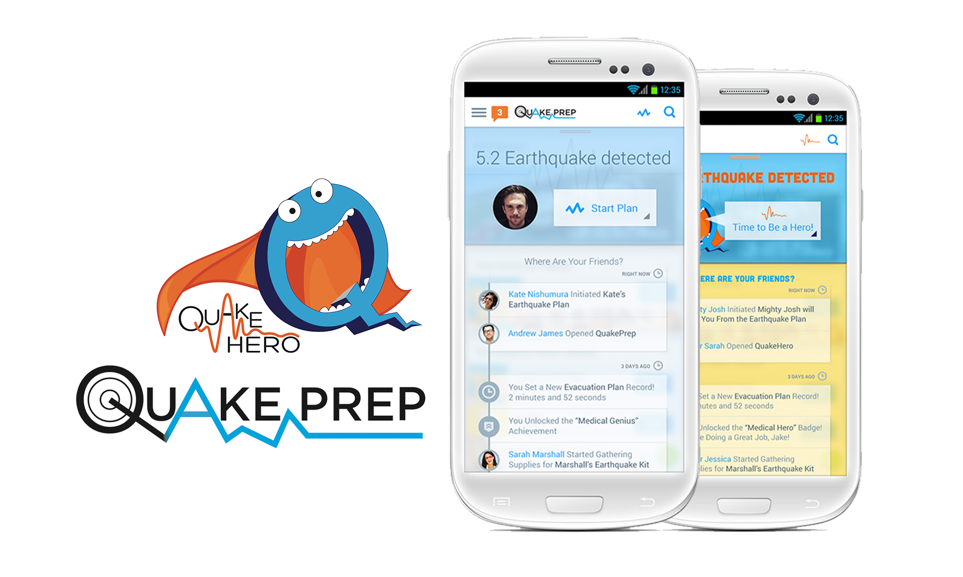
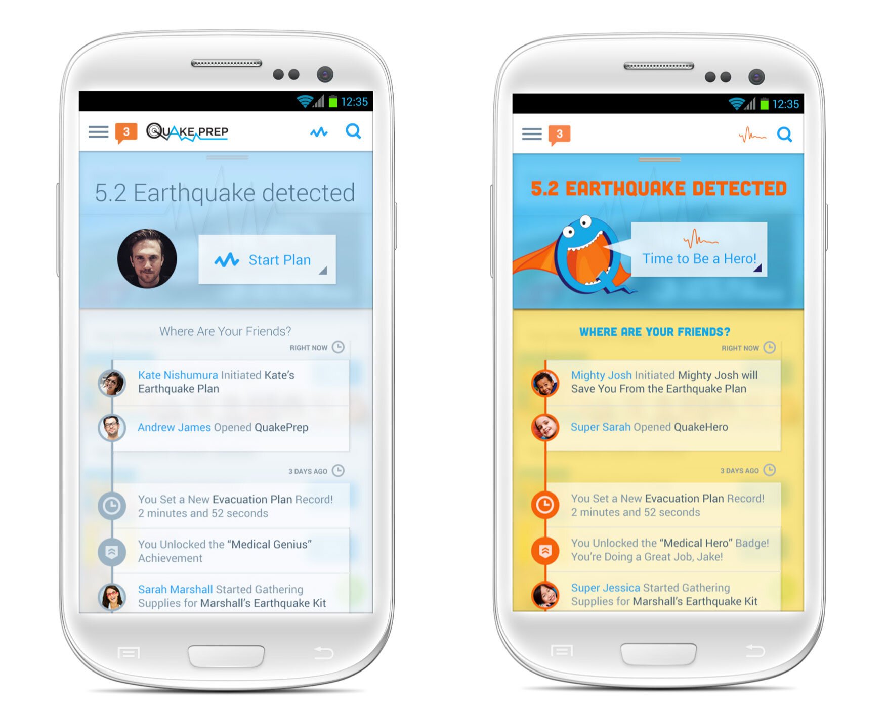
The App: QuakePrep, an earthquake preparedness app that makes sure you have a plan in case of an earthquake and helps you with checklists and resources if you are affected by one. The app will have 2 versions “QuakePrep” for the parents and “QuakeHero” for the kids.
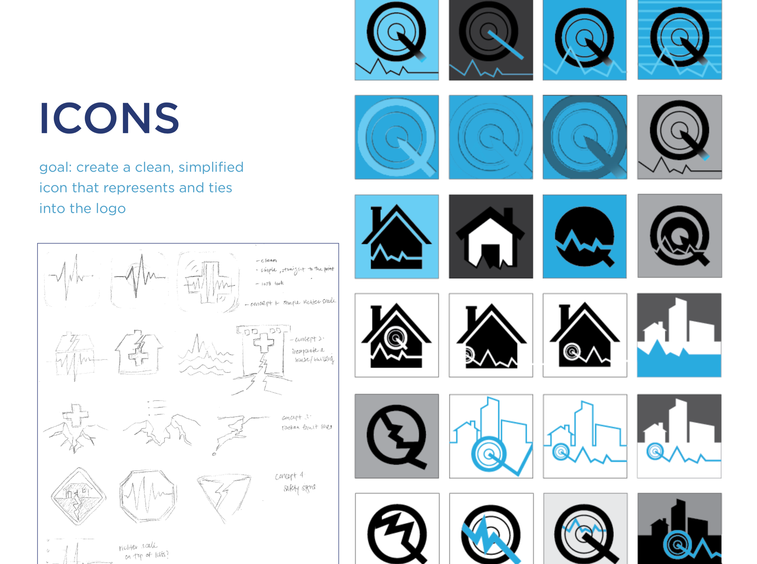
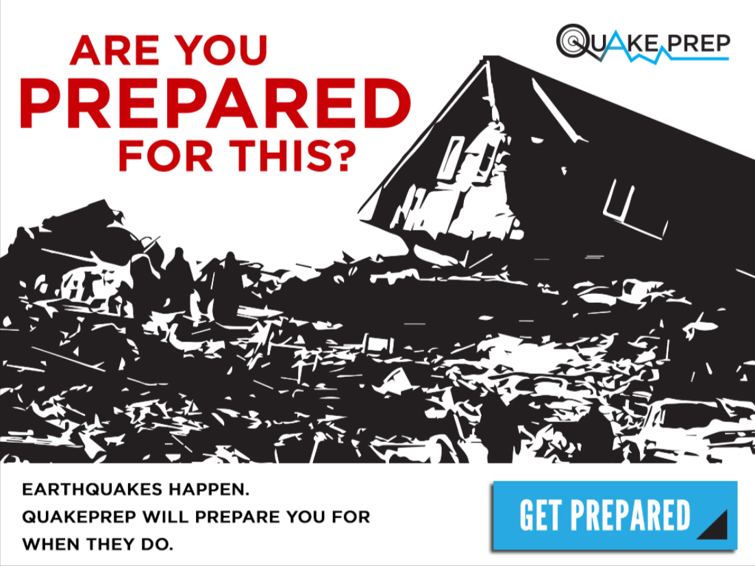
The challenge: Create branding, app icons, and ad creatives for both apps.
The Solution: For QuakePrep’s logo, I chose a play on the Richter scale. Studies show that the color blue blue has the power to manage stress and is a very soothing color that helps calm your mind, slow down your heart rate, lower your blood pressure and reduce anxiety. I did the logo and app color scheme in a soft blue to keep people calm as they checked their app during an earthquake. For the kids app, I went with brighter, more fun colors, to get kids excited about being an earthquake safety leader, a hero.